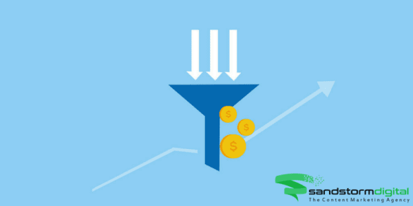
If you’re considering a website redesign or want to generate more leads from your website, it’s important to start with your homepage. Many businesses fail to optimize their homepage for conversions, despite the fact that it’s the doorway to a high proportion of their web traffic.
Your homepage is often the first experience potential customers have of your business. This means you only have a few seconds to make a great first impression and encourage further action. If you get it right, your homepage can be one of the most powerful sales tools you own. To maximize homepage conversions, remember the following four rules.
Answer Questions Before They’re Asked
One of the most effective ways to increase conversion rates from your homepage is to quickly answer the questions of your target audience. If you don’t, your homepage will suffer from high bounce rates, which will damage your sales and your search rankings.
Four questions you must try to answer before users have to scroll down:
- Who are you? (Make it clear what your business is offering.)
- Why should potential customers choose you over the competition? (Your competitive prices, superior service, or something else?)
- Why should potential customers trust you? (Display contact information, links to social media, trust badges, and testimonials.)
- How does the customer take the next step? (Use clear calls-to-action to tell visitors what to do next.)
Highlight Your Prospects’ Problems
Many people visit your site because they have a problem. They want a question answered, or they want a solution that they’ll pay for. Emphasize the problems they face as soon as they arrive on your site – it immediately demonstrates that you understand their needs.
Then highlight how your business can solve their problems. Many businesses make the mistake of just talking about themselves. Instead of falling into this trap, highlight how customers lives can be made better by using your products or services. If you can’t easily explain the benefits of your product or service, then you have a problem.
Prioritize Navigational Links
Your website visitors are looking for something. Help them find what they’re looking for without any obstacles, or they’ll navigate away from your site in a matter of seconds. Clear navigation is often mentioned in articles about website optimization, but it’s importance can’t be overstated. There are still many business websites that get it wrong.
Organize your links in order of importance, and avoid too many options which can lead to confusion. This is why leading brands go for minimalist designs. An uncluttered homepage with the main navigation links at the top, and clear links within the page are key to converting more visitors – whatever your conversion goals are.
Avoid Aggressive, Solitary Calls-to-Action (CTAs)
It’s essential to guide your visitors through the buying journey using effective CTAs. However, be careful not to use aggressive language. If you’re a startup, you can have a “Start your free trial now” button at the top of the page, but what if this scares some people away? To ensure you also cater to more skeptical visitors, include a “How it works” button alongside. The secret is to subtly direct people to different stages of the buying cycle.
The CTAs should obviously reflect your marketing goals, but they should always be easy to see and visible above the fold. Make them visually striking, in a color that contrasts with the background. Also optimize your CTAs for mobile users, so they can easily touch buttons with one finger.
Conclusion
If you’re attracting website traffic, but failing to convert visitors into customers, your homepage may need a makeover. A properly optimized homepage will inform new customers, guide them around your site, and encourage further action. Follow these fundamental techniques and you can benefit from higher search engine rankings and convert more visitors into paying customers.

